
Menu Studio
How do I open this screen? Press 🎨 Studio (Stüdyo) in the top bar of the Menu Editor.
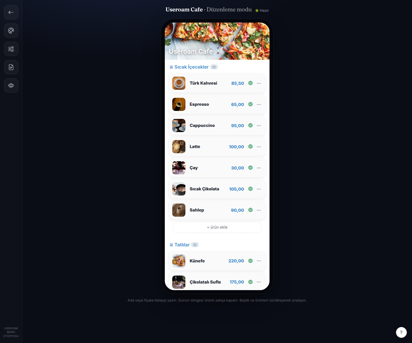
1. Editing mode
The heading shows the menu name and editing mode. You reorder section headings and items by dragging them, and you can click an item name or price and type over it directly. The status icon next to an item takes it off sale. + add item and + new section let you grow the menu from here as well.
2. Ready-made theme bundles
The bundle selector at the top changes every setting at once: Automatic (recommended), Atölye Krem (light, editorial), Gece · Noir (dark, centred), Ocak (kraft, trattoria menu), Canlı (bright, large photos). Starting from a bundle and fine-tuning below it is the quickest route.
3. Layout settings
- Service: Classic or Night (editorial).
- Layout: Classic (single flow) or category grid.
- Card: How items are presented — list (premium), grid, large photo or compact list.
- Grid: Automatic, 1 column, 2 columns or 3 columns.
- Scale: small, medium, large.
- Spacing: tight, medium, wide.
- Corner radius and shadow: low / medium / high and none / soft / pronounced.
4. Typeface and colour
- Typeface: The theme font plus ready pairings — Corporate (Lora + Inter), Editorial (Fraunces + Inter), Clean (Inter), Luxury (Cormorant + Inter), Classic (Cormorant + Nunito), Modern (Oswald + Rubik), Elegant (Lora + Noto Sans), Soft (Quicksand), Plain (Rubik).
- Accent colour: The highlight colour, set from the colour picker.
- Background: Theme default, solid colour, gradient or pattern. With a pattern you then choose dots, lines, squares or diagonal.
5. Price display
- Currency: Normal or small (faded ₺), which pushes the currency symbol into the background.
- Decimals: Smart (hides ,00) or always show.
6. Cover (hero) and buttons
- Cover height: short, medium, tall.
- Cover overlay: light, medium, dark — controls how readable text is over the cover photo.
- Cover position: top, middle, bottom.
- Button style: filled or outlined, with roundness low / medium / full.
Related pages: Restaurant Solution → Menu Editor, Online Menu.